1. Let it Breathe
White Space, Padding, breathing room, call it whatever you like. Designs thrive when there’s room for elements to breathe and give space between elements. When used appropriately padding between elements brings comprehensive visual clarity to a design.
While you can see this practice in action in print design its especially true on the web. With the ability to create unique interactive elements and having to design for various screen sizes you can find yourself working to make sure everything looks just right.
Let’s take a look at two examples of a blog post slider with different levels of spacing between elements.
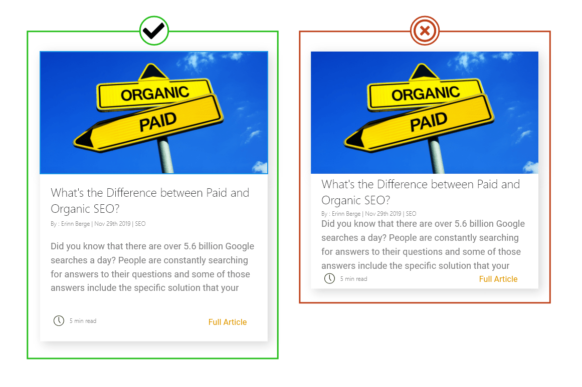
Just a bit of white space can go a long way in providing a visual focus for elements and keep a page with a lot of content from becoming overwhelming. Providing proper padding in paragraphs and headers can improve readability for your site as well. While it’s not something that most users will immediately think about it is something that when done poorly can be really jarring and send users away faster.
Try reading the two paragraphs below and notice the difference that a bit of padding makes.
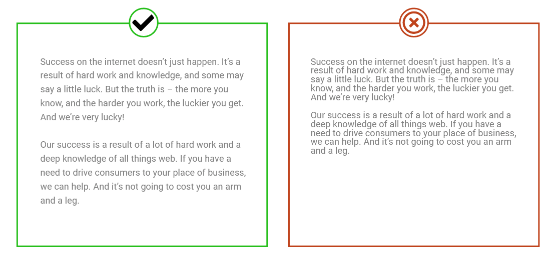
Adding line height makes your text more legible.
How to implement :
There are several ways to implement more whitespace into your design, most of which are going to be utilizing various forms of css. For example to add spacing between objects you’ll want to use margins while for spacing within an element you’ll be using padding.
For paragraphs of text, you can modify the line-height CSS rule and well as letter-spacing to make a change.
2. Simple Animations Make a Big Impact
I know! Animations?! It sounds like a lot of work. But don’t worry there are some great animations you can put into place on your site that can really take your design to the next level without having to reinvent the wheel.
Providing feedback to users is one of the most important things you can do to increase the allure of your site. One of the best ways to do this is to make clickable elements either change color or shape to highlight that a user can interact with them.
Take the humble button for example. Seen capping off many a contact form in the shape of a submit button it’s how you convince users to submit all of the information they have just compiled for you.
Let’s take a look at two examples. One with a color transition and one without. And see which one is more fun to click.
See the Pen
Simple Hover Button Animation by Samuel (@PixelSamuel)
on CodePen.
How’d we do that? We used CSS once again! This time we target the class of the object and use what’s called a pseudo-class to create an effect on hover. When an object hovers over it will adopt the traits of the CSS call that has the: hover pseudo-class. This transition is instantaneous though unless you use a CSS rule called transition. Transition does exactly what it sounds like; controls objects transitions between various states. Now let’s take a look at that example again with a transition of .4s applied to make the change less jarring.
See the Pen
Simple Hover Button Animation Part 2 by Samuel (@PixelSamuel)
on CodePen.
Looking good! You can apply this same logic with any sort of element you want to give a bit of style to. Links are a good place to start.
3. Optimize Your Images for Web
Now, this may be drifting a little more over into development territory but optimizing your images for the web can be one of the most impactful changes you can make to your site. Optimizing your images for the web can improve your website’s load times dramatically. Making your pages more accessible on mobile devices and optimizing your site for search engines.
Sizing your images for the web is easy too! There are plenty of tools to do just this. For example, Photoshop users have access to a save for web function. Just take your favorite image and go under File >> Export >> Save for web.
But really you can save a lot of space by keeping two rules in mind.
- Size the image for the container it is going to be in
- File type matters.
Plan ahead for your image sizes. With CSS you can set any image you want to whatever height or width you want but if you are doing all of your resizing in the browser, then the user has to download the full-size image first! Yikes!
While it seems simple, I can’t even track how many times I’ve gone onto sites that were struggling with their page load times because they had a 3200 x 2400px image being resized to fit in the header as a logo. Resizing your images for web will improve your load times and can even save you money.
To put it into non-technical terms that would be like mailing a letter but in order to put the stamp on you had to shrink down your favorite poster first to fit where the stamp goes. Just a lot of extra work that you can save your users from having to do.
There are several different types of files out there that can be used for images but in general, there are three commonly used file types…
- JPG – A lossy compressed file format. This makes it useful for storing photographs at smaller sizes and is great for photographs and realistic images that don’t need any transparency.
- PNG – A lossless compression file format. PNG’s support transparency, making them great for logos, icons, or large scale images that need a transparency layer.
- GIF – Limited to only 256 colors these are best for small icons/logos. In general, these are hard to use correctly and can be avoided unless you really want to fuss over every kb.
The best rule I follow is to use .jpgs for photographs and images that don’t need a transparency layer. While .png’s are for images that need a transparency layer, such as logos.
If you want to take things a (or don’t have access to a program such as Photoshop) I can’t recommend this tool enough for image compression: https://imagecompressor.com/
It’s 100% free, easy to use, and gets results quick.
Hopefully, this helps you speed up your site. You can expand on all of these tricks to really bring your site to the next level.
Looking to learn more about how to optimize your images for your website? Check out my full guide with best practices and examples!