There’s a lot of love and care that goes into designing intuitive user experiences. From meticulously pouring through fonts and colors to finessing the perfect copy there’s a lot of time spent on getting things just right. One of the lesser-known details that UX Designers deal with, microcopy, is proving its importance more and more as sites continue to evolve. Microcopy and its role in helping users to complete actions, address concerns, and build confidence can make a huge impact on a user’s experience.
In the end, our goal is to give our users the best experience possible. That means keeping the goal they want to complete accessible and easy to follow. Whether it’s filling out a contact form, buying a product, or signing up for a service, microcopy plays a big role for something so small. Microcopy that is brief, aware of its context, and personality-driven is a work of art that will keep you coming back.
What is Microcopy?
Microcopy is a term used to define all of those little bits of content on a website or application that live to help guide a user along on the way to their ultimate goal. These little snippets help tell users what to do while also helping address any concerns they may have; all to generate trust.
Need some examples? Think of…
- Search Bars
- Buttons
- Tooltips
- Error Messages
- Captions
- Newsletter Sign-ups
- Cart and Online Checkout
- Thank you pages
- All those other little bits of copy that help guide you through a site
Any bit of copy that is used to help guide users or cue them into functionality fits into the microcopy umbrella. These small gestures, when done right, help reveal a companies personality and attention to detail.
Users Are Travelers on a Journey
Want an analogy? Think of your users as travelers setting out on a journey across your application. Your job as a UX designer is to not only know where you want that traveler to go, it’s to make the trip there as easy and pleasurable as possible. Microcopy helps you create the roadsigns to guide the way, keeping the user feeling secure and on track.
To create great microcopy you have to know where you are guiding your users. And while every user is unique (and every application a work of art on its own), there a few universal signs of great microcopy: brevity, clarity, and context that will always be relevant.
1. Keep it Brief
Think of all the times you’ve heard the phrases: “keep it simple” or “less is more”. UX designers and Digital Marketers have known for years the fastest way to a potential customer’s heart isn’t through a wall of text.
Great microcopy, like a great roadsign, is simple and to the point. Learning to balance personality with brevity is a unique skill that takes a lot of work to get right. You want to avoid adding additional copy just for the sake of sounding smart.
Twitter is a good example of microcopy done right. When you log in, the journey to making a tweet is simple and the microcopy keeps it casual without adding unnecessary language. Twitter prompts its users with “What’s happening?”.
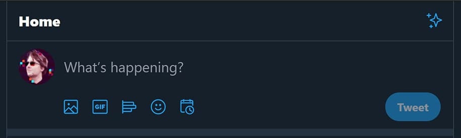
Twitter Keeps Their Call to Action Brief
This bit of direction is short while encouraging the user to take an action and giving them a prompt for some context. Microcopy should be concise and straight to the point while clearly guiding the user on the next step.
2. Make the Action Clear
Keeping your microcopy clear is an important piece of the puzzle. You don’t want to be too vague and you need to know what type of direction or assurance the user is looking for. Try to keep your language to simple everyday words that your audience will be familiar with. There’s no need to break out the thesaurus for clever wordplay.
If you’re trying to highlight a feature of your service, don’t hide it. Make sure the highlights of what you want your user to find are easy to spot as their eyes scan along with the page
Grammarly for example is an app that provides spellchecking for you while you browse and work on the web. The sign-up page they use for their site is simple and one of the biggest draws of the service is that there’s no cost.
Their goal is to get users to download and use their app on their browser of choice. The fact that its free is a big draw for potential users so they made it part of their call to action.
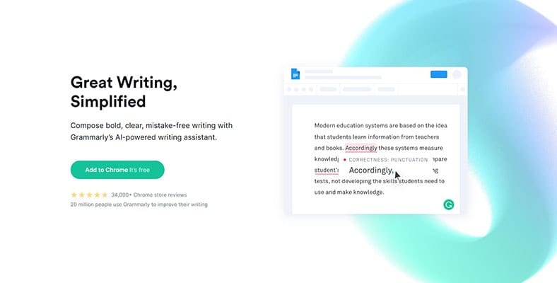
Grammarly Clarifies the price of their service right in their main Call to Action
By simply adding “It’s Free” to the download button, users are immediately reassured and given clear directions to “Add to Chrome” at the same time. That coupled with great typography and a color scheme that naturally draws the user to the button really highlights the love and care that went into making this page.
Additionally, clarity is extra important when it comes to users taking actions such as going through checkout. People will want to know what happens after they click a button or they’ll hesitate. While there’s the ability to inject personality into your microcopy, be mindful of where you do so.
3. Provide Context – Tell me what to do!
Users need to know what to do next. The journey you take users one should have enough roadsigns along the way to make sure that they never lose sight of the destination or take a wrong turn.
Context is crucial to empowering users with confidence and making sure you are giving the right clues at the right time. Great examples of contextual microcopy can be found in search bars across the web. Microcopy should be positioned to help guide users and make your application more accessible even for users who may rely on screen readers.
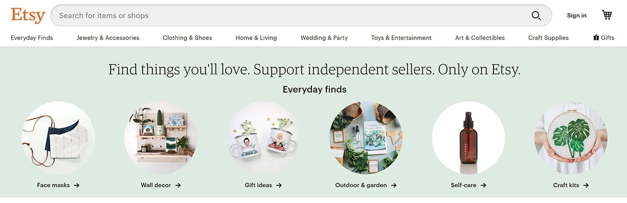
Etsy provides context for searches in and around their search bar
A fantastic example is when landing on the homepage of Etsy. The page prompts the user to search for items or shops and gives some ideas of what to search for. Etsy keeps it short, provides clarity on what the action is, and gives context of some things to search for (items or shops) while providing further ideas within the eyes view.
Context doesn’t have to be confined to search bars though. Providing a sentence or two to describe a service is another great example of microcopy at work.
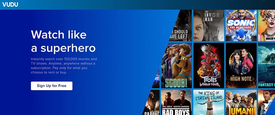
Vudu has several great examples of Microcopy
Vudu pulls users in with the tagline “Watch like a superhero” while providing a short but thorough description of its service. The action is clear (sign up for free) while giving the user an understanding of what the service is. Vudu even reassures the user its service is free by adding it to the call to action.
In Summary
Microcopy is all around us. UX Designers and Digital Marketers are getting more and more clever in how they convince users to follow through on actions. So as a designer or marketer keep in mind the road signs you are creating for your users’ journey and the key ingredients to great microcopy :
- Keep it brief and digestible so that users don’t feel overwhelmed.
- Make sure your language is clear and the action that follows is the one users expect.
- Use microcopy when it’s needed most: to provide the user with information so that they know what to do next.
Take a close look at your current site to make sure that you are guiding users along. You can use the concepts above to help craft your own exceptional microcopy that will work to convert visitors into long-lasting customers.
Looking for help? Send us a message and learn more about our Digital Marketing and Web Design services here at Loud Canvas. I know we’d love to hear from you. And hey if you enjoyed this article then maybe your friends will too, so why not share it…